
Colors carry messages before anyone says a word. A green ribbon pinned to a jacket, a purple wristband on a teacher, a yellow shirt at a community walk: each one starts a conversation that many people find hard to begin out loud. For mental health advocacy, color gives supporters a shared, low-pressure signal that says I care about this, and I am safe to talk to.
The tricky part is that awareness colors overlap. A single ribbon can stand for several causes, and the same shade can mean different things depending on who is wearing it. Here is a clear look at the colors most often tied to mental health, what they mean, and where the meanings blur.
Why Color Works as an Awareness Tool
Awareness ribbons became a simple, portable way for advocacy groups to signal support for a cause. A ribbon costs almost nothing, fits in a pocket, and can be worn by anyone from a teenager to a hospital administrator. That accessibility is the point. Someone who is not ready to give a speech about depression or anxiety can still wear a color and let others decide whether to ask about it.
Color also works because it is visual and memorable. Campaigns lean on it for the same reason sports teams do: repetition builds recognition. Green ribbons, green logos, and green profile frames all reinforce one message over time. The color does not diagnose anyone or explain a condition. It signals openness, and that is enough to shift how a conversation starts.
Green: The Primary Mental Health Awareness Color
Green is the designated color for mental health awareness. The green ribbon is recognized internationally as the symbol for mental health awareness, and it is the most common color you will see at mental health events, awareness month campaigns, and community fundraisers.
Why green? The choice comes down to symbolism. Green represents new life, renewal, and growth, themes that are easy to find in nature and easy to apply to recovery. Someone moving through grief, burnout, or anxiety is often described as growing toward something steadier. Green captures that process better than a color associated with danger or alarm. It suggests that mental health is not a static state but something that keeps developing, and that people can move forward even after hard seasons.
That symbolism is also practical. Green is calm and non-threatening, which matters when the goal is to get people talking rather than to shock them. A color tied to growth invites the person on the other side of the ribbon to ask a real question instead of changing the subject.
What the Green Ribbon Means Beyond Mental Health
Green is a crowded color in the awareness world. Green ribbons carry more than 30 different meanings, and mental health is only the most commonly championed one. Depending on the organization and the list you consult, green ribbons have also been used for bipolar disorder, cerebral palsy, and a range of other causes.
This overlap is not a flaw in the system so much as a side effect of it. Dozens of causes share a small number of ribbon colors, and groups choose shades based on symbolism, tradition, or what is still available. The practical takeaway is simple: a green ribbon most often signals mental health awareness, but if you need to be certain about a specific campaign, ask the person or organization behind it. Context does the rest of the work.
Yellow and Suicide Prevention
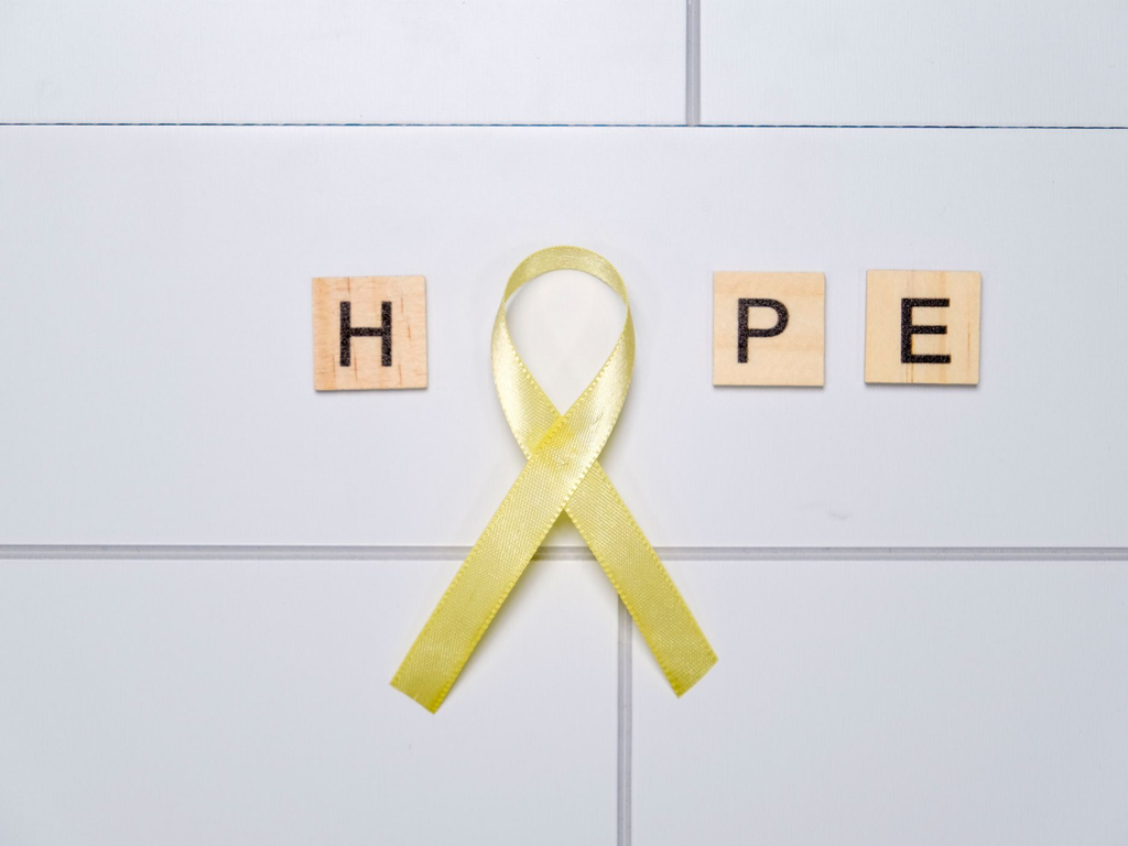
Yellow is widely used for suicide prevention awareness. The color tends to read as warm and hopeful, which fits a message built around reaching out before a crisis and keeping people connected to support. You will see yellow in prevention campaigns, school programs, and memorial walks.
Because suicide prevention sits inside the broader mental health conversation, yellow and green often appear together at the same events. That pairing is useful. Green speaks to mental health as a whole, while yellow points directly at prevention and the importance of checking in on someone who is struggling. If you are planning an event and want to cover both, using green as the base color with yellow accents keeps the message clear without confusing anyone.
Purple, Red, and Other Colors You May See
Purple has been used for general mental health awareness in some campaigns, though it is one of the most contested colors in the ribbon world because so many causes claim it. Red is a sign of support for people living with HIV, and it also appears in other advocacy spaces, so a red ribbon alone rarely tells you what someone is championing. Blue, teal, and silver show up in various campaigns as well, and their meanings shift depending on the organization.
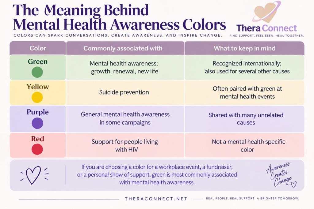
If you are choosing a color for a workplace event, a fundraiser, or a personal show of support, green is the safest and most recognizable choice for mental health. Adding yellow is a reasonable next step if prevention is part of your message.
How to Wear or Display an Awareness Color Respectfully
Wearing a color is easy. Wearing it well takes a little thought, especially if you are not personally affected by a mental health condition.
At events and in public
Keep it simple. A green ribbon, a green shirt, or a green lanyard communicates the message without turning anyone into a walking billboard. If someone asks what it stands for, answer honestly and briefly, then leave room for them to share or to change the subject. The most helpful response to a disclosure is usually a version of thank you for telling me, not a list of advice.
Online and at work
Profile frames, banner images, and small desk items are gentle reminders that cost nothing and pressure no one. In a workplace, a green ribbon on a badge or a shared resource list in a break room can lower the threshold for someone to ask about support. Avoid using awareness colors as decoration unrelated to the cause. If green shows up on a party invitation in the same month as a mental health campaign, the signal gets muddled and people stop reading it.
Color Is a Starting Point, Not a Substitute for Care
A ribbon does not treat anything, and it is not meant to. What it can do is normalize the subject enough that someone feels less alone in bringing it up. That matters, because the gap between needing help and asking for it is often less about resources and more about stigma.
If a color prompts you to finally say something out loud, the next step is finding the right support. Therapy is not one-size-fits-all. Some people want a provider who specializes in anxiety, some are navigating grief or relationship trauma, and some need evening telehealth sessions because of a work schedule. A directory that lets you filter by location, specialty, and session format keeps that search from turning into another source of stress. Take the first step at your own pace, and let the green ribbon be the nudge rather than the whole plan.
Frequently Asked Questions
What is the official color for mental health awareness?
Green is the designated color for mental health awareness, and the green ribbon is recognized internationally as its symbol. The color was chosen for its association with new life, renewal, and growth, themes that fit recovery and long-term mental wellness. You will see green most often at awareness month campaigns, community walks, and fundraising events that support mental health organizations.
What does the green awareness ribbon mean?
The green ribbon is most commonly used to champion mental health awareness. It is not exclusive to that cause, though. Green ribbons carry more than 30 different meanings across the awareness world, and some lists also connect green to bipolar disorder and cerebral palsy. If you need to know what a specific green ribbon stands for, ask the organization distributing it.
What color ribbon represents suicide prevention?
Yellow is used for suicide prevention awareness. Because prevention falls within the broader mental health conversation, yellow and green frequently appear together at the same events and campaigns, with green representing mental health overall and yellow pointing specifically toward prevention, outreach, and checking in on people who may be struggling.
Does wearing an awareness color actually make a difference?
It can start conversations that would not otherwise happen. A visible color signals that you are open to the topic, which makes it easier for someone to ask a question or share something difficult. The color itself does not treat anything, but it lowers stigma, and lower stigma is what moves more people toward professional support when they need it.
Your Expertise Deserves to Be Found.
People are searching for support. Make it easier for them to discover you.
Leave a Reply